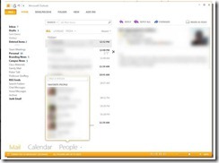
reA new screenshot has emerged from Office 15 showing the new Metro user interface on Outlook. I really like the new interface, it’s simple, sweet and to the point. For more updates, screenshots and information on new Microsoft software, from Office 15 to Windows 8, be sure to check out our forums.
The screenshots also reveal a more flattened user interface within Outlook. Microsoft’s Outlook UI no longer seems cluttered and provides users with direct access to their mail in a simple and yet familiar way. Microsoft’s Metro design language is an internal code name for a typography-based design languages created and used by the company. Microsoft originally started using Metro in Media Center and showcased a full version in the company’s Zune products. Microsoft’s latest mobile operating system, Windows Phone 7, also features the Metro look and feel throughout. Microsoft has started to use the Metro UI on more of its web properties to produce a clean, fast and simple look.
MSTechPages is a participant in the Amazon Services LLC Associates Program, an affiliate advertising program designed to provide a means for sites to earn advertising fees by advertising and linking to Amazon.com. As an Amazon Associate, we earn from qualifying purchases at no extra cost to you.


