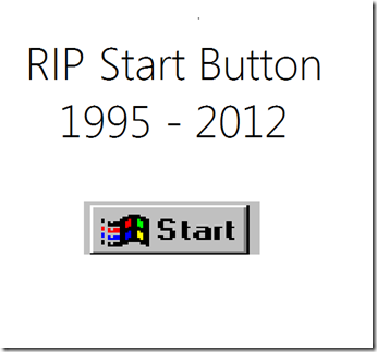
The Windows Start Button has been replaced with the new Start screen in the Metro UI. Good move or not? I know there is a lot of disappointment in it’s disappearance, and it is one of the first thing that people notice. I’m expecting, hoping for a registry hack to enable it and have been looking around for it. So far, no dice. It would be nice to have it there to ease in the transition to the new Metro UI. What’s your opinion? Was it time for the 17 year old Start Menu to go the way of the dinosaur?
When Windows 95 was released, there was a LOT of bad press and people that were very upset in the new fangled button in the lower left of your screen. Now, there is unrest in the removal of it to move to a newer, possibly more efficient replacement (time will tell if it is truly more efficient).


